
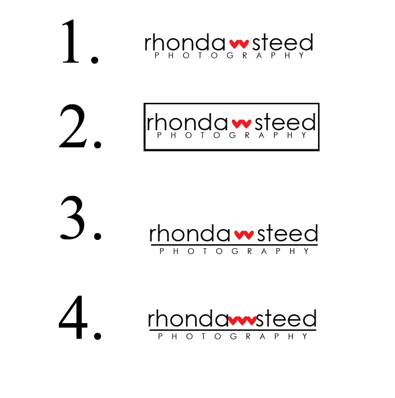
Secondly, I'm making a new logo. So here's some options and tell me which you think it best. In design you should always go in uneven numbers. But I just LIKE the 2 hearts. So that being said, which one do you think suits me best or just looks to nicest.
Thirdly, I've decided ya'll would be pretty swell to start using regularly. Thoughts on it?
Fourthly (is that a word?), my friend Christina and her sister have started a great cooking blog. And they've had some GREAT posts on there. So check it out here at Frankly Entertaining.
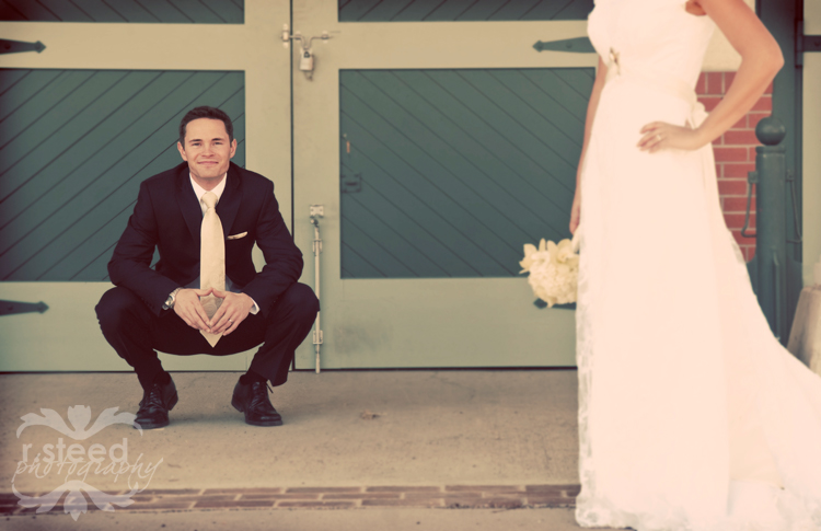
Fifthly (definitely NOT a word) a picture I love to share from Matt and Jasmine's wedding that I am madly editing and almost done (wahoo!)
42 comments:
I like the first logo...very nice! Love the wedding pic too
Love number 3!!
Number 3 def!
I'm with the crowds saying that I like nunber 3 the most! It looks sleek! Pretttty wedding photo. I love when you post them.
i really like #3. Have you tried it with just one heart? just a thought...
I like #3. That picture is so nice!
#3 is my fave! Can't wait to see your new stuff and what a great wedding picture!
First choice is #2, second choice is #3.
I like number 2
I love number 3. The line under your name highlights you and makes photography stand out as well. Who you are and what you do.
I like #3.
I like 2 and 3 (I know - I'm very helpful). The border on 2 makes it seem very business-like, but 3 has a more creative vibe to it. Like I said - I'm very helpful.
i like #3
number 3 it is. 3 hearts does not look good, you're right. and i like alysha's thought on just one, maybe? i'm excited to see the new direction.
I like #2 and #3.
Beautiful wedding picture. Love it!
Thanks for the link love!
I like number 2.
#3 is my choice!!
I hate the last one and love the one with the box around it. I forgot to count before I clicked over to comments - oops!
Well, you really don't need another comment, but I like #3.
I like #3.
I like three the most!
Hi,
I like #3 the best and after reading the rest of your comments it looks like it's a clear winner, but which one do you like the best? I think that's most important since it's your company.
By the way Charlie is a go!!!
I am curious about the new direction.
I was driving downtown today and saw the mural on 4th street and thought of that great Lucy picture.
My favourite is logo #1
Number 3 for sure. And y'all is bad. Don't use it.
#3 from me...is your middle initial w? The two hearts make me think Rhonda W Steed, but just in a fancy way...just a thought.
xoxoxox
You know I love #3. These are awesome. :)
Can't wait to see where your photography business goes next. :)
Love #3. Definitely.
And what are you talking about, you want to start saying "y'all?" Is that what you're saying? I applaud that decision. Then, will you please move to Texas and be my neighbor?!?!
Can't wait to see your new direction. I would LOVE to talk to you on the phone about this. Seriously, email me your number.
the murds at gmail dot com
I vote for #3 as well....
Lea
my initial vote was #1.
Then I saw the popularity of #3, went back and looked more closely, and chose #3.
Peer pressure?
I liked #3 best without reading the comments. I'd be interested to compare what it looks like with just 1 heart.
#3
I'm excited to see what you're new direction will be. Sometimes in design, breaking the rules gets more attention, so go with two hearts. I loved #3 immediately. It makes more sense. What if you flipped the two hearts so they make a frame (like artists do with their hands to frame off what they're seeing... does that even make sense? lol - okay nevermind.) Looks great! Simplified and sleek. You're so talented, girl!
Ingrid
I think that I like #3 as well. It looks like you had a fun trip to Utah. Its always nice to have a little break from the kids.
Definitely #1 - Looks great!
I think you are a fabulous photographer by the way. Oh and you should definitely start saying y'all, especially if you're not from the south because that's just funny.
Oh and just something you might want to think about....the two hearts could possibly look like a "w", especially if printed in black and white or printed in a smaller size. But if you're middle name starts with a W then your good! :)
Tough call. I like both #1 and #3. I think I might like #3 more if the underline were a little finer. Just sayin' ...
Can't wait to hear what you're hoping to get up to.
I like, um, the one with the line, no box. I forget which one it is.
Ok, another question tho... is it you who is taking a 12 week online photography class? My husband is dying to take classes, but we have no time to have him GO OUT to the college to take classes. Where do you find them?! If it isn't you, it might be Heather M.... I'll go stalk her now too :D
#3 is my pick!
3 is gorgeous, love it!
also, I love "y'all" - I say it all the time, even though Paul always laughs at me when I use it :) it's useful. So is "might could" or "might should" or "used to could". :) My southern roots might be showing...
Number three is my fav.
Hi Rhonda--I'm finally posting on your blog. I like #3. :)
I like number three. If you count the two words and the heart icon then it is three on top and one on the bottom.
Post a Comment